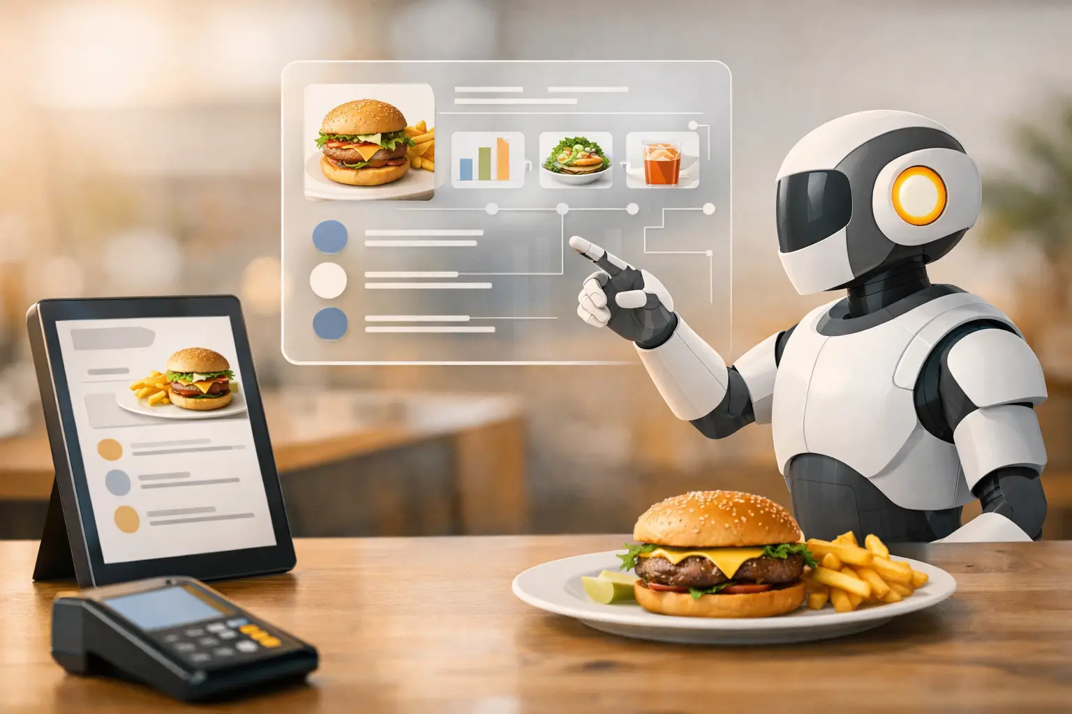
A menu that looks rushed usually sells like it was rushed. The photos feel inconsistent, the layout fights the eye, and the premium item you want customers to notice gets buried under filler. This ai menu design guide is built for food businesses that need a better system - not a one-time design exercise, but a faster way to produce menus that look sharp, stay on brand, and support sales.
What an ai menu design guide should actually help you do
Most menu advice stops at aesthetics. Use better fonts. Add whitespace. Highlight bestsellers. That matters, but commercial menu design is really about throughput and control. You need a menu that can be updated when prices change, resized for print and digital, refreshed for seasonal promotions, and paired with visuals that still look like the same brand.
AI changes the workflow because it reduces the slowest part of menu production: creating and replacing food visuals at scale. For a restaurant group, ghost kitchen, cafe chain, or packaged food brand, that means fewer delays between product changes and live creative. It also means you can test more often. A brunch menu, late-night menu, catering menu, and delivery menu do not need the same visual hierarchy, and they should not be designed as if they do.
The practical value is simple. AI lets teams move from occasional redesigns to ongoing optimization.
Start with the menu's job, not the design software
Before you generate a single image or place a single text block, define what the menu is supposed to do. A dine-in menu is built for browsing and upsell. A delivery menu is built for speed and clarity. A digital board is built for scanning from a distance. A catering menu is built around package comparison and order confidence.
That distinction matters because AI can accelerate output, but it cannot fix a weak commercial brief. If your menu needs to drive average ticket size, the layout should support add-ons, bundles, and premium anchors. If the goal is operational simplicity, reduce choice friction and standardize item presentation. If the goal is launching a new product line, visuals should direct attention there first.
This is where many teams overproduce. They generate too many assets before locking the menu's primary job. Faster production only helps if the direction is right.
Build an AI menu design workflow around consistency
The strongest AI menu design guide is not about one clever prompt. It is about repeatability. That means choosing a visual system before you create assets.
Start with a defined image style for your food category. Decide how close, bright, styled, and polished the food should appear. A fast-casual salad brand may want clean overhead compositions with bright natural tones. A burger concept may need tighter framing, richer contrast, and more texture. A dessert shop may benefit from a more indulgent, glossy treatment. Once that style is set, keep it stable across hero items and supporting items.
Then match that visual system to the menu structure. Hero items deserve stronger image treatment than low-margin sides. Combo sections need modular layouts. Limited-time offers need room for fast swaps. If you use AI-generated food visuals, create them in batches by category so your burger section looks related to itself and your drinks section looks related to itself.
This is also where food-specific tools have a real advantage over general image generators. You spend less time correcting anatomy problems, ingredient confusion, or styling choices that look impressive in isolation but unusable in a commercial menu. Umami AI, for example, is built around food visuals rather than generic image creation, which makes consistency easier when you need production-ready outputs instead of experiments.
Use AI visuals where they improve decision speed
Not every menu item needs a photo. In fact, adding too many images can slow customers down and make the page feel cheap. The better approach is selective emphasis.
Use visuals for signature items, premium items, new launches, and products that sell better when customers can immediately understand the appeal. This is especially useful for highly visual categories like pizza, burgers, desserts, bowls, beverages, and seasonal specials. For plain utility items, text may do the job better.
There is a trade-off here. More imagery can increase appetite appeal, but it can also overcrowd a layout and create maintenance work when products change. AI reduces the production burden, but you still need editorial discipline. A menu with five strong visuals usually performs better than a menu with twenty average ones.
Design for the channels you actually use
A common menu mistake is building one version and forcing it everywhere. Print, in-store screens, web menus, third-party delivery platforms, and social promotions all have different constraints.
Print menus need tighter control over spacing, readability, and image resolution. In-store digital boards need fewer words, larger type, and simpler composition because the customer is standing, not studying. Website and ordering menus need clean modular assets that work on mobile. Social versions need visual punch and often benefit from animated menu promos or short loops rather than static exports.
AI helps here because once your base food assets are defined, you can adapt them into multiple formats faster. The key is to treat menu design as a content system, not a fixed document. Build once, then version intelligently.
Where teams save the most time
The biggest gains usually come from recurring updates. Seasonal drinks, price changes, holiday bundles, local store variations, and campaign-specific inserts can all be produced without resetting the whole design process. Instead of scheduling another shoot or rebuilding from scratch, you update the specific assets that changed and keep the rest of the system intact.
That speed matters more for growing operators than for single-project brands. If your business updates offers often, AI is not just a creative shortcut. It is an operational advantage.
Keep the menu commercial, not decorative
A good-looking menu that hides margin drivers is still a weak menu. Design choices should support selling behavior.
Use visual hierarchy to direct attention toward high-value items. Keep names and descriptions easy to scan. Place prices consistently so comparison feels natural. Group items in ways that reduce decision fatigue. If a section has too many choices, AI-generated visuals will not solve the underlying problem.
Descriptions should also match the image standard. If the visual presents the product as elevated and premium, the copy should not sound generic. If the brand is fast, affordable, and casual, the styling should not overpromise. Menu design works best when image, language, and price positioning agree with each other.
This is one of the bigger risks with AI. It can produce visually idealized food that outpaces the actual product experience. For some brands, that works as aspirational merchandising. For others, it creates expectation gaps. The right level of polish depends on your category, customer, and pricing position.
A simple production model for teams
If you manage menus across locations or campaigns, keep the workflow lean. Start with brand rules: fonts, colors, spacing, image style, and section order. Next, create a priority list of items that deserve visuals. Then generate and approve assets in batches, not one at a time. After that, build channel-specific layouts for print, digital, and ordering use.
Once the system is set, use it for iteration. Test a menu hero image against a text-led version. Test whether combo visuals outperform individual product visuals. Test whether highlighting one limited-time item lifts attachment sales. AI makes these tests practical because the cost of variation drops sharply.
What to watch before publishing
Review every menu for three things: visual consistency, legibility, and product accuracy. The food should look like it belongs to one brand. The menu should still read quickly on the actual screen or printed size customers will use. And the product representation should stay close enough to reality to avoid disappointment or customer complaints.
If any of those break, the menu may look modern but perform poorly.
Why this ai menu design guide matters now
Menu design used to be a periodic project. For most food businesses now, it is an active production layer tied to promotions, pricing, channel strategy, and content velocity. That shift changes what good design means. It is no longer just about making a menu look better than last quarter. It is about building a workflow that can keep up with the business.
The teams getting the most value from AI are not using it as a novelty filter. They are using it to produce better food visuals faster, maintain brand consistency across formats, and update revenue-driving assets without waiting on a full creative reset.
If your menu changes often, sells visually, or needs to work across print, digital, and social, the best next move is not a full redesign. It is building a repeatable system that makes strong menu design easier every time you need it.