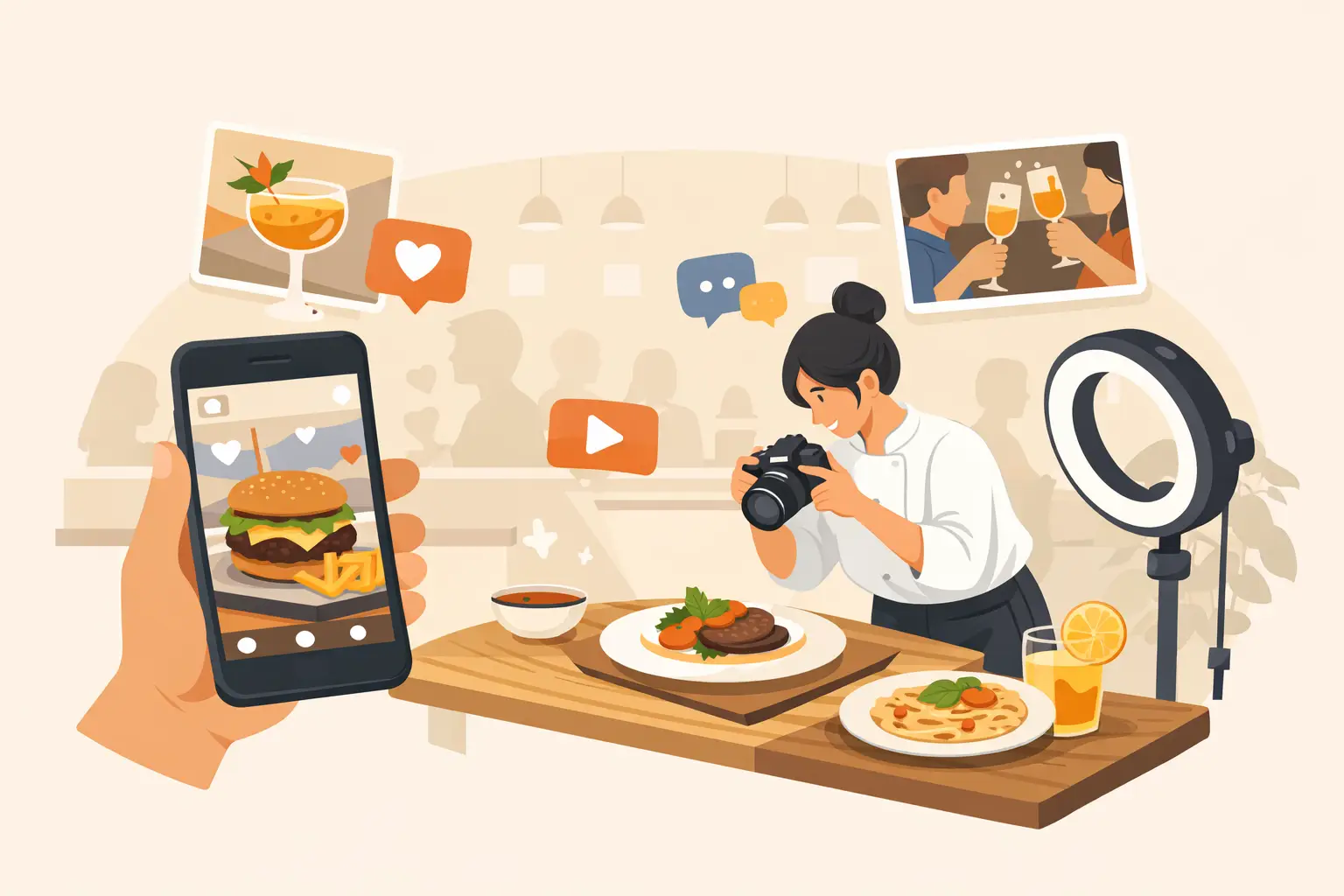
A new menu item can be excellent and still disappear in the feed if the image does not earn a second look. The best restaurant social media visuals do more than make food look attractive. They create instant appetite appeal, make the offer clear, and give customers a reason to act before they keep scrolling.
For restaurant teams, the goal is not to publish more random content. It is to build a visual system that can support daily posts, limited-time offers, paid campaigns, delivery promotions, and seasonal launches without requiring a full photo shoot every week.
Start With Appetite, Not Decoration
The strongest food content is specific. It shows the detail people want to taste: a crisp edge on fried chicken, steam rising from noodles, a glossy sauce, a cheese pull, a cold drink with condensation, or the texture inside a cut sandwich. These signals make an image feel immediate.
Over-styled visuals often work against that goal. A table full of props may fit a magazine spread, but it can bury the product in a social post. When someone sees the image at phone size, they should understand what the dish is within a second.
Use a clear hero. For a menu item post, the food should occupy most of the frame. Keep the background supportive rather than competitive. A deep, moody setting can work for a premium steakhouse, while bright natural color may suit a fast-casual bowl concept. The right choice depends on the brand, but the dish must remain the focal point.
Prioritize texture and scale
A close crop can be more effective than a full table scene when the product has a strong visual feature. Show the crackle of a crust, the layers of a burger, or the fresh ingredients in a salad. Wider shots are useful when the selling point is abundance, shareability, or atmosphere.
Scale matters too. A hand lifting a taco, dipping fries, or pouring a drink gives the viewer an immediate sense of portion size and use. It also adds human energy without forcing a full lifestyle shoot.
Build for the Format Before You Create
Restaurant content loses impact when a horizontal image is squeezed into a vertical placement or when text is hidden by app interface elements. Create visuals around where they will run.
Vertical 9:16 assets are the practical default for Stories, Reels, and short-form video. They fill the screen and leave room for movement, captions, and an offer. A square format remains useful for profile grids and some ad placements. Landscape visuals can support websites, digital menu boards, and certain campaign placements, but they are rarely the first choice for organic social reach.
Plan safe space from the start. Keep essential food details, product names, pricing, and calls to action away from the top and bottom edges. This is especially important on Reels and Stories, where interface elements can cover the image.
Use motion where it adds value
Short video is a high-value format for food because preparation and finishing actions naturally create appetite appeal. A sauce drizzle, a tray coming out of the oven, a drink pour, or a final garnish can communicate freshness better than a static post.
Motion should have a job. A slow pan across a dish can work for a premium presentation. Faster cuts can fit a lunch special, happy hour, or value-driven offer. Avoid adding animation simply because video performs well. If the movement does not clarify the food, build anticipation, or support the offer, a strong still may be the better asset.
Create a Repeatable Content Mix
A restaurant cannot rely on hero shots alone. Customers need to see newness, proof, personality, and reasons to return. The most effective social feeds balance these needs while maintaining a consistent visual standard.
A useful production mix includes these four content types:
- Product-first posts that spotlight bestsellers, new dishes, bundles, and limited-time offers.
- Process visuals that show grilling, pouring, assembling, finishing, or packaging.
- Occasion-based content for holidays, game days, weekends, catering, and local events.
- Brand-building assets that reinforce the restaurant's color palette, service style, ingredient quality, or dining experience.
This mix prevents the feed from becoming repetitive while keeping the food at the center. It also gives marketers a practical way to connect content with commercial goals. A new item needs a product asset. A catering push needs shareable spreads and clear service context. A loyalty offer may need a clean graphic that still feels food-first.
Make Promotions Easy to Understand
Promotional visuals often fail because they try to communicate too much. A crowded post with several dishes, a discount, multiple dates, small-print conditions, and decorative text asks the customer to do too much work.
Choose one message per asset. If the post is about a Tuesday taco offer, make the tacos and the offer the visual priority. If the campaign is about delivery, show the meal in a delivery-ready context and keep the ordering message direct. Supporting details can live in the caption, on the landing page, or in a follow-up Story frame.
Text overlays are useful when the offer needs clarity, but they should not cover the most appetizing part of the dish. Use high contrast, short copy, and a consistent type treatment. Your audience should recognize the brand even before reading the restaurant name.
Keep the Brand Consistent Without Making Every Post Identical
Consistency is not using the same background in every image. It is creating recognizable patterns across your output: lighting direction, color temperature, cropping style, typography, plate styling, and level of polish.
A burger brand may rely on bold, high-contrast color and close-up stacks. A neighborhood Italian restaurant may use warm light, generous serving shots, and richer table textures. A wellness-forward cafe may use clean compositions, fresh ingredients, and bright natural tones. The system should reflect what customers can expect when they order.
This is where a food-specific visual workflow becomes operationally useful. Rather than starting every post from scratch, teams can establish reusable composition directions for core categories, then generate variations by dish, season, offer, or platform. Umami AI is built for this kind of commercial food production, helping teams create polished images and short-form food visuals without coordinating a new studio shoot for every campaign.
The trade-off is that consistency requires standards. If multiple people create content, define approved visual references, color direction, crops, and text treatments. Without those guardrails, volume can quickly make a feed look disconnected.
Use Realistic Visuals That Match the Actual Product
Appetite appeal should not become false advertising. If an image makes a burger look twice as large as what arrives in the bag, customers may click once but will not stay loyal. The same applies to ingredient claims, portion sizes, packaging, and menu availability.
Aim for an elevated version of the real experience. Better lighting, stronger composition, and careful styling are expected. Misrepresenting the product is not.
For AI-generated food content, this means reviewing every output with the same standards used for photography. Check for inaccurate ingredients, impossible plating, strange utensils, inconsistent packaging, and brand details that do not match your operation. A visual is only campaign-ready when it is both attractive and credible.
Measure What Moves More Than Likes
Likes can signal broad appeal, but restaurant marketing needs more useful performance signals. Track saves, shares, profile visits, menu clicks, offer redemptions, delivery orders, and sales tied to a specific campaign. A simple dish close-up may get fewer likes than a humorous video but generate more menu traffic.
Test variables one at a time when possible. Compare a close-up against a wider lifestyle composition. Test a static product post against a five-second motion clip. Run the same offer with different visual hooks. Over time, the results will show whether your customers respond more to indulgence, value, novelty, social proof, or convenience.
The best restaurant social media visuals are not necessarily the most elaborate. They are the ones that make the right customer hungry, communicate a clear reason to order, and can be produced again next week. Build around that standard, and your content calendar becomes a working sales asset rather than another demand on the team.