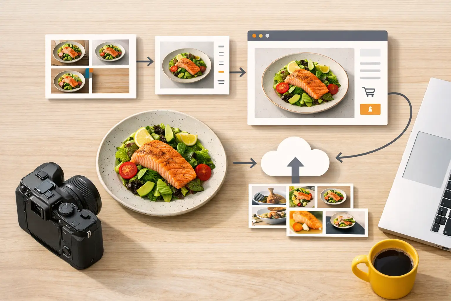
A product page can lose the sale before a shopper reads a single ingredient. If the hero image feels inconsistent, the packaging is hard to see, or the food looks unlike the rest of the catalog, shoppers hesitate. A strong food ecommerce image workflow gives your team a repeatable way to produce clear, appetizing, channel-ready visuals without treating every new SKU like a full studio production.
For food brands, restaurants, beverage companies, and marketplaces, the goal is not simply to make more images. It is to make the right image set for every product, campaign, and channel while keeping visual standards intact. That requires a workflow built around product data, approved creative direction, production speed, and final export requirements.
Start With the Images That Actually Drive Revenue
Not every food product needs the same visual treatment. A direct-to-consumer snack brand may need a clean packshot, a close-up texture image, a lifestyle scene, and promotional creative for paid social. A restaurant selling meal kits may need an accurate plated hero, portion-focused detail shots, and seasonal campaign variants. A beverage seller may need consistent can or bottle images across flavors, formats, and retailer listings.
Start by defining image roles before generating or producing anything. This prevents teams from creating attractive assets that do not fit a commercial use case. For each SKU, identify the minimum image set required for the product page, then identify the optional assets needed for ads, email, social, retail media, and seasonal campaigns.
A practical product-page set often includes a primary image that shows the package or finished item clearly, a secondary angle, a detail image that communicates texture or ingredients, and a contextual image that shows serving or usage. The exact mix depends on whether shoppers need to evaluate packaging, portion size, preparation, or product quality before buying.
The primary image should be the least experimental asset in the set. It needs to make the product recognizable at a glance, especially in search results and category grids. Save bolder compositions, stronger props, and seasonal styling for supporting content and campaign placements.
Build a Food Ecommerce Image Workflow Around Inputs
The fastest production teams do not begin with a blank prompt or a loose creative request. They begin with organized inputs. Every product should have a source record that contains the information needed to create accurate visuals without repeated back-and-forth.
This record can live in a product information system, a spreadsheet, or a shared project workspace. What matters is that the fields are consistent. Include the product name, SKU, flavor or variant, package format, approved claims, key ingredients, dietary labels, brand colors, target channels, and any visual restrictions.
For packaged goods, add approved packaging reference images from multiple angles. For prepared foods, include the actual recipe, portion guidance, plating notes, and ingredients that must appear. A burrito bowl with black beans, roasted corn, and avocado should not become a generic bowl with ingredients the customer will not receive.
Creative direction should also be structured. Instead of asking for “premium lifestyle food photography,” define the surface, lighting, camera angle, crop range, color temperature, prop limits, and background rules. A short brief with fixed choices is easier to execute and review than a broad description that can be interpreted differently by every creator.
This level of setup may feel slower at the beginning. It pays off when new flavors launch, packaging changes, or a retailer requests a different aspect ratio. Your team can reuse the same approved input system rather than rebuilding creative direction from scratch.
Separate Product Accuracy From Creative Variation
Food ecommerce visuals have two jobs that can pull in different directions. They need to sell the product, and they need to represent it truthfully. A glossy image may earn attention, but it creates a problem if the package, serving size, garnish, or color does not match what arrives at the customer’s door.
Treat product accuracy as a non-negotiable review layer. Packaging text, logo placement, label color, product shape, and visible ingredients need to match approved references. This is especially relevant for food and beverage brands with regulated claims, allergen messaging, or retailer-specific content standards.
Then create variation around the accurate product. Change the setting, occasion, crop, background, or supporting ingredients while keeping the central item correct. A sparkling water can remain accurate while the creative shifts from a bright summer picnic to a clean office lunch scene. The product stays recognizable, while the campaign gets fresh visual range.
AI production is useful here because it can speed up concept development and create more scene options than a traditional shoot schedule allows. But it still needs brand controls. Umami AI is designed specifically for food visual production, which makes it practical for teams that need food-forward compositions without rebuilding every asset from generic image tools.
Create a Controlled Production Queue
Once inputs and creative rules are ready, organize production by priority rather than by whoever asks first. A queue should reflect commercial impact: new product launches, out-of-stock replacement imagery, high-traffic product pages, major promotions, and recurring content needs.
Group related work together. Produce all flavor variants using the same composition system, then generate campaign variations from that approved base. This reduces visual drift between products and makes review faster because stakeholders are evaluating a consistent set of rules.
Your queue should also distinguish between core catalog assets and promotional assets. Catalog images need longer shelf life and higher accuracy. Promotional images can move faster, but they still need to reflect the actual product and approved brand direction. Mixing both in one approval path usually slows the work that matters most.
For larger catalogs, assign status labels such as brief ready, in production, accuracy review, brand review, exported, and live. Clear status tracking prevents duplicate work and helps marketing, ecommerce, and creative teams see where a launch is getting stuck.
Review at the Right Moments
Too many reviews make image production slow. Too few create expensive cleanup work later. The answer is not a single approval process for every asset. It is a review system based on risk.
Review the first approved visual direction closely. Confirm that the packaging, food styling, lighting, color palette, and composition meet the brief. Once that foundation is approved, use it as the reference for related variants. Reviewers can then focus on exceptions instead of reopening the entire creative discussion for every image.
A useful quality check covers four areas: product accuracy, brand consistency, channel fit, and technical readiness. Product accuracy asks whether shoppers will recognize what they are buying. Brand consistency checks whether the image belongs next to the rest of your catalog. Channel fit confirms that the crop and composition work where the asset will appear. Technical readiness verifies dimensions, file format, resolution, and background requirements.
It depends on your business whether legal or regulatory review is needed for every image. If imagery includes visible nutritional claims, promotional messaging, or highly specific serving suggestions, add that checkpoint before publishing. For simple catalog imagery, a trained ecommerce or brand owner may be able to approve much faster.
Export for Placement, Not Just for Storage
One finished image is rarely one finished deliverable. A square product-page image, a vertical social story, a horizontal email banner, and a retail media placement all require different crops and focal points. If export is an afterthought, teams either spend hours resizing assets manually or publish images that cut off the product.
Build channel requirements into the original brief. Specify aspect ratios, safe zones, file naming conventions, image dimensions, and whether text overlays will be added later. Keep a master version with enough room around the product for common crops, but do not rely on that master to solve every format automatically.
File names should make assets easy to find. Include the SKU or product family, visual type, flavor or variant, orientation, and version date. This sounds operational, because it is. A clean asset library reduces the time spent asking whether a file is current, approved, or safe to reuse.
Measure What the Workflow Improves
Speed matters, but it is not the only metric. Track how long it takes to move from brief to approved asset, how many revision rounds each asset needs, and how often teams reuse approved visual systems. These numbers show whether the workflow is reducing production friction or simply generating more files.
On the ecommerce side, watch product-page conversion, add-to-cart rate, engagement with secondary images, and performance by creative format. Results will vary by category. A close-up ingredient shot may improve confidence for premium sauces, while a clean package image may matter more for pantry staples sold through search.
The useful lesson is to connect image output to a business decision. If a visual format consistently performs better, make it part of the standard set. If a complex scene takes too long and does not improve results, reserve it for high-value campaigns.
A scalable workflow gives your team room to move quickly without making every asset feel rushed. Start with accurate product inputs, establish a repeatable visual system, and let creative variation happen inside clear commercial guardrails. That is how a growing catalog stays fresh, recognizable, and ready for the next channel request.