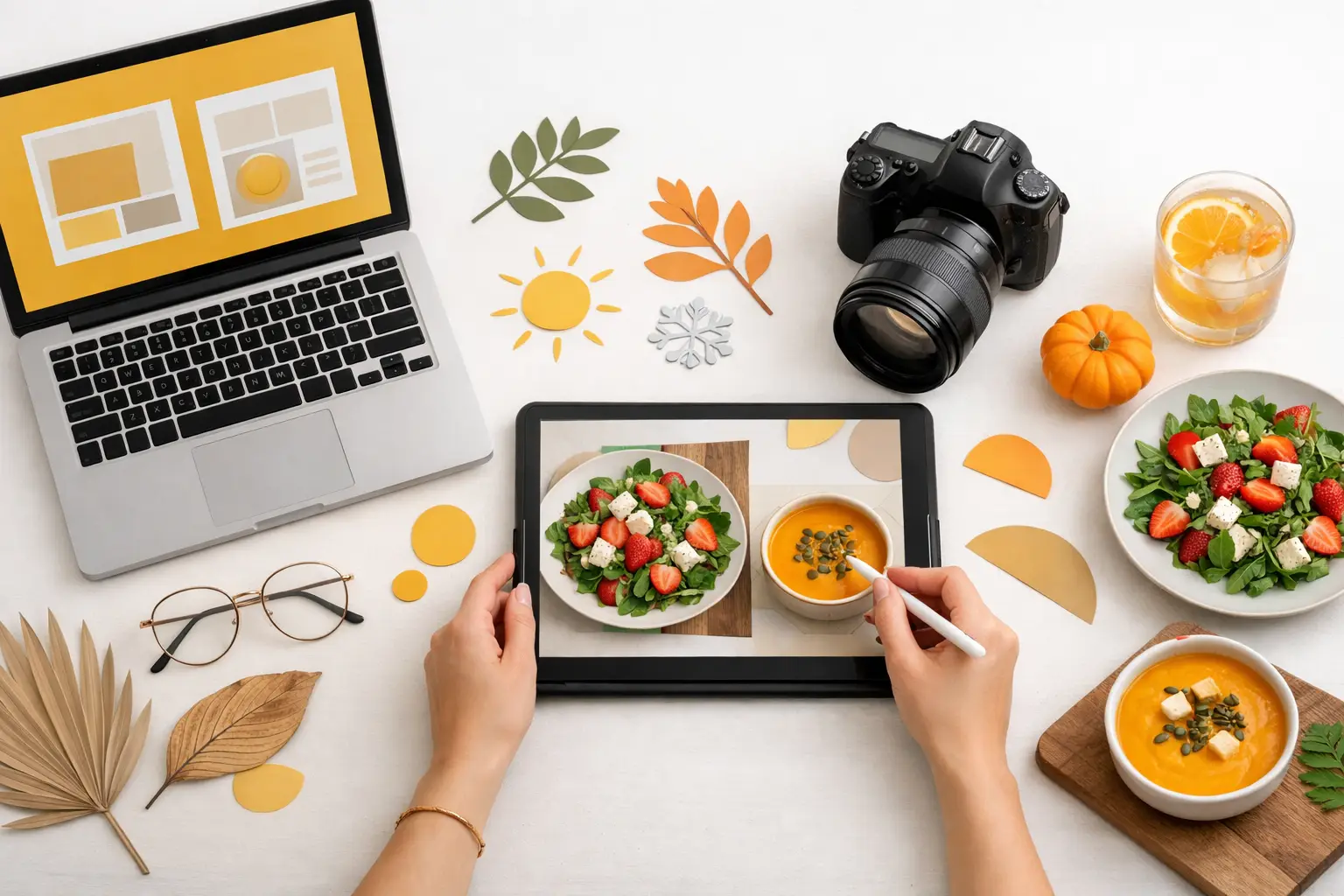
A seasonal menu has a short commercial window. If the visual campaign arrives two weeks after the menu launch, the opportunity is already shrinking. The ability to generate seasonal menu campaign assets quickly gives restaurants, food brands, and agencies more time to test creative, promote the launch, and keep channels fresh while the offer is still relevant.
Traditional food photography can produce excellent work, but it requires scheduling, food styling, studio time, retouching, and approvals. That process makes sense for flagship packaging or a major brand refresh. It is less practical when you need a fall latte visual this week, three holiday dessert variations next week, and localized social creative before the next promotion begins.
Food-specific AI changes the production model. Instead of treating each seasonal campaign as a single photo shoot, teams can build a flexible visual system with a clear hero concept, reusable composition rules, and channel-specific variations.
Start with the campaign, not the image
The fastest way to create mediocre seasonal content is to prompt for "a festive food photo" and hope for something usable. Seasonal menus need commercial direction before visual generation begins. Define what the campaign must sell, who it needs to reach, and where the assets will appear.
A quick-service restaurant introducing a limited-time spicy chicken sandwich may need bold, high-contrast visuals designed for drive-thru screens, delivery apps, and paid social. A bakery launching a winter collection may need a warmer, more detailed visual language that highlights texture, gifting, and premium ingredients. Both are seasonal campaigns, but the composition, lighting, styling, and crop requirements are different.
Build a short creative brief around the menu item, seasonal cue, target channel, offer, and brand rules. Keep it operational. Specify the product's hero angle, the emotional cue you want to create, the background treatment, preferred colors, negative space for copy, and any elements that should never appear.
For example, a spring beverage campaign might call for a chilled strawberry matcha in a clear cup, bright natural side lighting, a soft blush and green palette, condensation, a clean tabletop, and open space in the upper left for promotional text. That is far more useful than asking for a "beautiful spring drink."
Generate seasonal menu campaign assets in a system
Seasonal campaigns need volume, but volume alone is not the goal. Your paid ad, menu board, email header, delivery listing, and social post should feel like parts of the same campaign. The most efficient approach is to generate a core image set first, then expand it into intentional variations.
Start with one hero visual that establishes the campaign's product presentation. This image should make the food immediately recognizable and leave enough room for the message. For menu launches, appetite appeal matters more than decorative styling. Steam, melt, glaze, crisp texture, fresh garnish, and believable portion size all affect whether an image works commercially.
Once the hero direction is approved, create supporting compositions using the same product logic. A tight crop can emphasize texture for social. A wider horizontal scene can support an email banner or website feature. A vertical composition can carry an offer message in a Story or short-form video cover. The product should remain consistent even as the setting, camera distance, and copy space change.
Use a repeatable production sequence:
- Create hero concepts in a few distinct visual directions before choosing one.
- Refine the winning direction for product accuracy, composition, and brand fit.
- Generate channel-specific crops and layouts from that direction.
- Produce a reserve set of alternate assets for testing, reposting, and late campaign needs.
This approach avoids a common problem: generating dozens of unrelated images that look appealing individually but cannot function as one campaign.
Keep seasonal cues controlled
Seasonality should support the food, not bury it. A pumpkin soup does not need a table covered in pumpkins. A holiday cookie campaign does not need every surface filled with ornaments, snow, and ribbon. When props overwhelm the product, the image stops working as menu marketing.
Choose one or two seasonal signals that reinforce the offer. Fall may mean warm wood, soft amber light, cinnamon dust, or a restrained leaf accent. Summer may mean bright daylight, condensation, citrus, and clean outdoor color. Winter may mean richer shadows, deep red accents, or a subtle linen texture. The exact choice depends on your brand and menu item.
This restraint also makes assets more reusable. A lightly seasonal beverage visual can work through an entire promotional period. An image packed with holiday symbols may become unusable the day after the holiday passes.
Design for the channels that move the offer
A single square image is rarely enough for a seasonal launch. Every channel imposes different visual requirements, and retrofitting one asset into every format often creates bad crops, crowded copy, or a product that is too small to sell.
For menu boards and delivery platforms, prioritize clarity. The item needs to read fast, with a familiar angle, clean lighting, and minimal environmental distraction. These surfaces often reward straightforward product imagery over highly styled scenes.
For paid social, use stronger visual contrast and leave intentional room for offer text, price points, or calls to action. Test a product-led version against a more atmospheric version. The best performer can depend on audience familiarity. Returning customers may respond to the limited-time offer; new customers may need a clearer view of what they are ordering.
For email and website placements, create landscape layouts with a clear focal point and an area reserved for headline copy. Keep product placement purposeful rather than centered by default. A well-positioned dish can give your design team room to add copy without covering the food or rebuilding the image.
Short-form video adds another layer. A static seasonal visual can become a useful motion asset when you animate movement that supports appetite appeal, such as rising steam, a slow camera push, falling garnish, or a subtle pour. Do not animate simply because the channel supports video. A restrained motion treatment is often more premium and easier to use alongside campaign typography.
Protect brand consistency while moving fast
Speed is only valuable if the output still looks like your business. Seasonal campaigns often drift because each promotion gets a new color system, styling approach, or product treatment. Over time, customers see a collection of disconnected posts instead of a recognizable brand.
Create a practical visual rule set for recurring campaign work. It can be as simple as preferred lighting, background range, camera angles, plating style, color boundaries, and how much copy space your team typically needs. These rules make approvals faster because stakeholders are reviewing a controlled set of choices rather than debating the campaign from scratch.
Product accuracy deserves its own review. AI-generated food imagery can be highly effective, but the final asset must represent the real item customers receive. Check ingredients, serving vessels, toppings, portion cues, and brand-specific packaging. If the seasonal menu item includes a particular sauce swirl, branded cup, or garnish, make that detail part of the generation direction and quality-control process.
This is where food-specific workflows matter. Umami AI is built around creating commercial food visuals, helping teams move from an approved dish direction to campaign-ready images and motion without treating food as a generic product category.
Use variation for testing, not random output
Campaign variation has a cost, whether you are paying for a new photo shoot or using image and video credits. Generate more options where the decision has commercial value. Test the parts of the creative most likely to change response: product angle, level of close-up detail, background color, copy space, and offer visibility.
Do not spend production capacity making tiny changes no customer will notice. If two versions differ only in a nearly identical garnish placement, they are unlikely to teach you anything. Instead, compare a clean product shot against a lifestyle composition, or a bold color background against a neutral one.
Keep the strongest assets active, then rotate secondary variations as frequency rises or the promotion enters a new phase. Early in the launch, lead with the clearest product and offer. Later, use detail shots, ingredient moments, serving suggestions, or motion variations to give the campaign a new visual reason to appear in the feed.
Build a faster approval path
Seasonal deadlines are often delayed by feedback loops, not image creation. Reduce friction by giving stakeholders a small, organized set of options. Present one recommended hero direction, one alternate direction, and a defined set of channel adaptations. Ask for decisions tied to the brief: Is the product appetizing and accurate? Does the image leave room for the offer? Does it match the approved seasonal look?
Avoid open-ended feedback such as "make it pop" or "try something different." That language creates unnecessary rounds because it does not identify what needs to change. A direct note such as "increase contrast on the sandwich, remove the background props, and create more space above the drink for the headline" keeps production moving.
The payoff is not just a faster launch. It is a campaign library your team can use for retargeting, social scheduling, menu updates, email refreshes, and the next limited-time offer. Start with a focused brief, generate the hero asset first, and let every variation earn its place in the campaign.