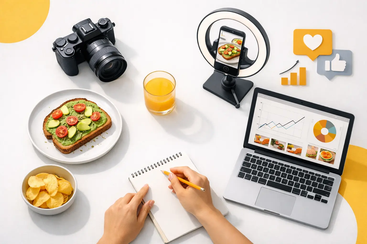
A burger can look great and still be wrong for your brand. The lighting may feel too editorial, the styling may imply a price point you do not serve, or the image may clash with the packaging, menu, and ads already in market. This guide to branded food imagery is about building a visual system that makes every food asset recognizable, appetizing, and ready to use across commercial channels.
For restaurants, CPG brands, ghost kitchens, and agencies, the objective is not simply to generate more attractive food photos. It is to produce the right image quickly, repeatedly, and at a cost that supports ongoing marketing work. That requires clear creative rules before a single image is created.
What branded food imagery actually does
Branded food imagery connects appetite to recognition. It gives customers visual cues about what they can expect from your product, your service, and your price point before they read a headline or tap an order button.
A fast-casual brand may need bright overhead compositions, clean surfaces, generous portions, and energetic color. A premium chocolate company may need close crops, controlled shadows, tactile textures, and restrained props. Neither approach is more correct. The right approach is the one that consistently reflects the product and the customer you are trying to attract.
That consistency has practical value. When an email, delivery listing, paid social ad, and product page use the same visual language, campaigns look coordinated even when assets are created weeks apart. Teams spend less time debating subjective preferences, and customers spend less time figuring out what the brand represents.
Start with a visual brief, not a prompt
The fastest way to get inconsistent output is to begin with vague direction such as “make it look delicious.” Delicious is a result, not a production specification. A useful brief gives your team a repeatable set of decisions that can be applied to every product, promotion, and seasonal campaign.
Define the product first. Include the exact item, key ingredients, serving size, container or packaging, and details that cannot change. For a beverage, that may mean the can design, ice level, garnish, condensation, and glassware. For a pizza, it may mean crust thickness, cheese coverage, slice count, toppings, and whether the product is shown whole or served by the slice.
Then define the context. Is the item a hero product on a simple background, part of a dinner table scene, or shown in a hand for a social-first moment? The same entrée can need radically different composition for a menu tile, a homepage banner, and a vertical story ad.
Finally, specify the brand cues: color palette, lighting style, surface materials, prop limits, camera angle, crop style, and amount of negative space. Keep this brief short enough to use, but detailed enough that two people would make similar creative choices from it.
Build a practical brand visual kit
Your visual kit does not need to be a 40-page document. It should answer the questions creators face every day. Establish your preferred backgrounds, such as warm wood, stone, saturated color, or clean white. Set a lighting direction, whether that is crisp daylight, moody side light, or high-key studio light. Choose the angles that best sell your products, including overhead, 45-degree, straight-on, macro detail, or handheld.
Also document what to avoid. If your brand is simple and value-driven, elaborate linen, antique cutlery, and excessive garnish can make the food feel overstyled. If your packaging must be recognizable, do not let it become a small, unreadable object at the edge of the frame. Exclusions are often as useful as preferences.
Choose composition based on placement
A strong food image is not automatically flexible. A horizontal homepage image may fail in a vertical ad placement. A close-up that creates appetite can leave no room for promotional copy. Plan composition around where the asset will appear before you create it.
For menu and delivery platforms, prioritize clarity. The food should be large, instantly identifiable, and minimally obstructed. Customers should see what they are ordering without decoding the scene. A slight angle can add depth, but the product remains the point.
For paid ads, leave intentional copy space. Position the food to one side, keep the background controlled, and make sure the image still reads when cropped for multiple formats. For social, use tighter crops, movement cues, bold color contrast, or a serving moment that earns attention in a crowded feed.
E-commerce usually needs a more disciplined system. Use consistent scale, lighting, and placement across product listings so shoppers can compare items easily. Lifestyle visuals can support the product page, but they should not replace clean product-led imagery when the buyer needs to assess flavor, format, or package size.
Make the food look believable
Food visuals must be appetizing, but commercial credibility matters more than visual excess. An unrealistically tall sandwich, perfect sauce swirl, or impossible number of toppings may grab attention once. It can also create distrust when the delivered product looks materially different.
Aim for the best realistic version of the item. Show fresh texture, appropriate shine, and clear ingredient separation. Preserve physical logic: melted cheese should behave like melted cheese, steam should match a hot dish, and a drink should not have contradictory reflections or floating garnishes.
This is especially important with AI-generated work. Review hands, utensils, labels, typography, ingredients, and product structure at full size before publishing. Small errors are easy to miss in a thumbnail and highly visible in a paid campaign or printed menu. Use generation speed to create options, then apply a real quality-control pass.
Guide to branded food imagery: use variation with discipline
Production at scale creates a common tension. You need enough variety to prevent campaigns from looking repetitive, but too much variation weakens brand recognition. The answer is not to reuse the same image everywhere. It is to vary selected elements while holding the core system steady.
Keep the visual constants consistent: palette, lighting family, product styling standards, and overall level of polish. Rotate the variables that support a campaign: crop, setting, seasonal accents, human interaction, dish pairing, or callout space. A summer campaign can introduce citrus, ice, and brighter surfaces without abandoning the brand’s established food photography style.
Think in asset families rather than isolated images. A new menu item may need a clean hero image, a vertical social composition, a promotional banner with negative space, a close-up texture shot, and a bundle or meal-context image. Creating these together reduces mismatched styling later and gives marketing teams usable options for each channel.
Create a workflow your team can repeat
A brand system only works if it fits the pace of your marketing calendar. Start by organizing requests around campaigns, product launches, and recurring content needs. Instead of generating one-off assets whenever someone asks, define the set of placements required and create a production batch.
A simple approval flow can prevent rework. First, validate the product representation and composition. Next, check brand alignment: colors, lighting, props, and overall tone. Then verify technical requirements, including dimensions, text-safe areas, and file naming. The final review should focus on product accuracy and visual defects that could damage trust.
Track the creative inputs that perform well. If a particular angle improves click-through on delivery ads or a certain background works better for a beverage line, add that learning to the visual brief. Over time, your imagery system becomes more efficient because decisions are based on performance, not just preference.
Specialized food visual tools can accelerate this workflow by keeping generation centered on dishes, ingredients, plating, and commercial compositions. Umami AI, for example, is built for teams that need food-focused image and video output without scheduling a new photo shoot for every campaign variation.
Know when to use AI and when to use photography
AI-generated food imagery is particularly useful for campaign concepts, seasonal variations, social content, launch previews, menu extensions, and volume production across formats. It reduces the cost and coordination required to create new visual directions, especially when products or promotions change often.
Photography remains valuable when exact product fidelity is non-negotiable. This can include regulated packaging, highly distinctive products, detailed labels, or hero assets where customers need to see the literal item they will receive. In many cases, the most efficient approach is hybrid: use approved product references as the source of truth, then create supporting branded scenes and format variations around them.
The decision depends on risk, not ideology. If an asset must document the exact product, prioritize precision. If it needs to sell a campaign idea, fill a content calendar, or test creative directions quickly, scalable generation can be the better production choice.
Measure more than aesthetics
A polished image is only successful if it supports a business result. Match performance metrics to the placement: click-through rate for ads, add-to-cart rate for product pages, conversion rate for ordering flows, or saves and shares for social content. Compare creative approaches with enough volume to identify patterns rather than declaring a winner based on one post.
Also measure operational output. Track how long it takes to move from request to approved asset, how many revisions each campaign requires, and how many usable variations you get from a single creative direction. For teams managing frequent promotions, production speed and consistency often matter as much as headline engagement.
The next food asset your team creates should not start with “make it prettier.” Start with the product truth, the placement, and the visual rules your customer already recognizes. That is how food imagery stops being a one-time creative task and becomes a production system that keeps up with the business.