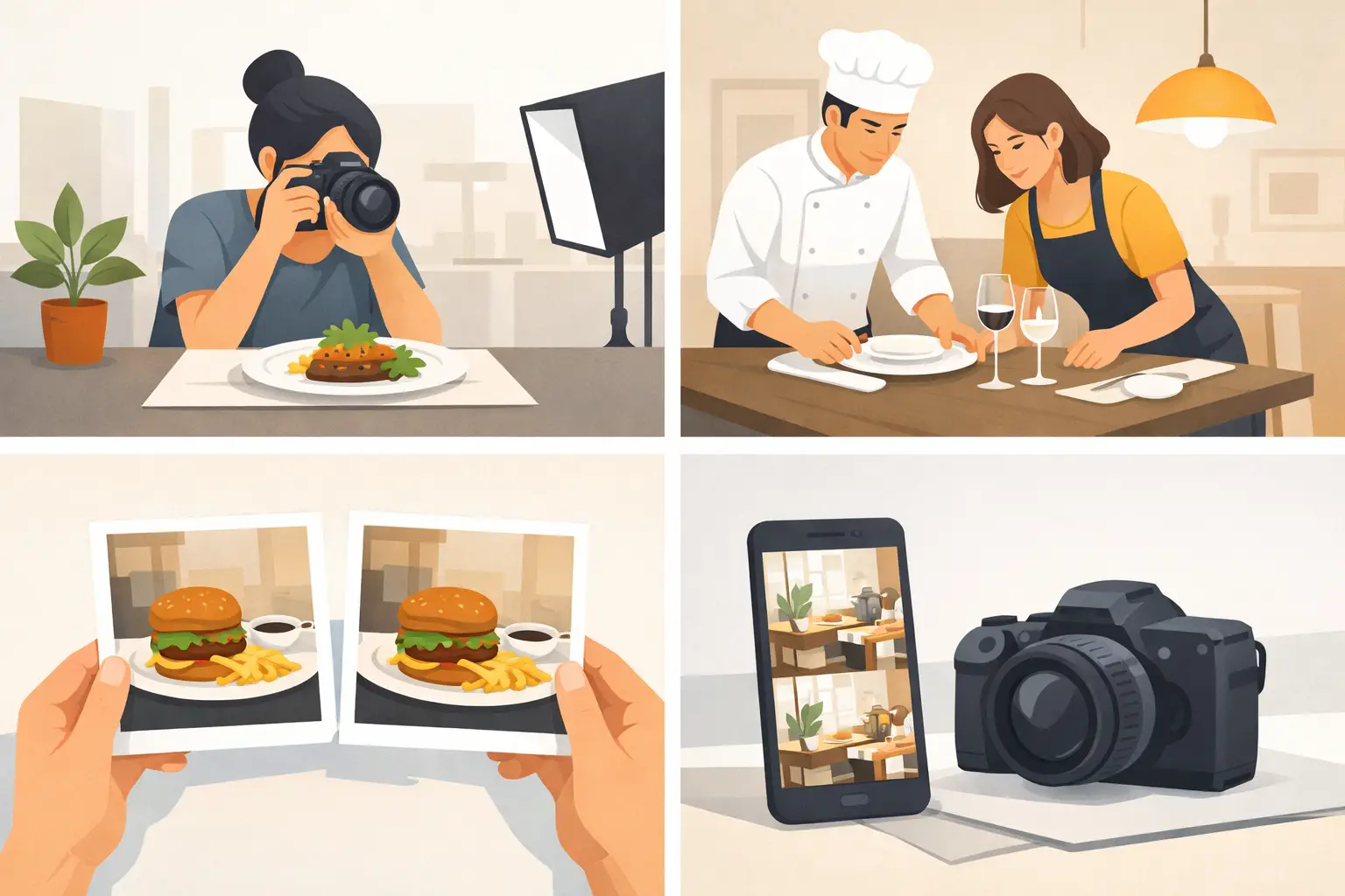
A burger shot with warm, dramatic lighting can make a restaurant look premium. The same burger photographed under flat kitchen lights can make the brand feel cheap, even when the food is identical. This guide to restaurant image consistency is built for teams that need to produce menus, social posts, delivery listings, ads, and location-specific promotions without letting every asset look like it came from a different business.
Image consistency is not about making every photo identical. It is about making each image immediately recognizable as yours. For restaurant brands, that recognition affects appetite appeal, menu confidence, campaign performance, and the perceived quality of the food before a customer takes the first bite.
What Restaurant Image Consistency Actually Means
A consistent restaurant visual system gives customers familiar signals across every touchpoint: food styling, color treatment, framing, props, background, lighting, and editing. A customer may see a paid social ad at lunch, browse a delivery app in the afternoon, and visit your website later that night. The food should feel like it belongs to one brand in all three places.
This matters most when content is produced by multiple people. A franchise team may have local marketers. An agency may work alongside an internal designer. A growing ghost kitchen may need several concepts represented in one shared production workflow. Without defined visual rules, output volume creates drift.
Consistency also protects against a common commercial problem: promising one experience and showing another. If your menu images are polished, colorful, and close-up while social content is dark, distant, and casually shot, customers receive mixed quality cues. The issue is not just aesthetic. It can reduce trust.
Start With a Visual Operating System
Most restaurants have a logo file and a few brand colors. That is not enough to guide high-volume food imagery. Build a practical visual operating system that tells creators what a finished image should look like and what it should avoid.
Start by defining your food point of view. Are dishes styled as generous and craveable, clean and ingredient-forward, or elevated and minimal? A fast-casual bowl brand might emphasize fresh layers, visible texture, and bright daylight. A late-night wing concept may benefit from darker contrast, sauce shine, and tighter crops. Neither approach is inherently better. The right choice depends on the customer, price point, service occasion, and menu.
Then document the repeatable production choices. Specify the preferred camera angle, such as overhead, 45-degree, or close side profile. Choose a lighting direction and contrast level. Set background rules, including tabletop materials, color fields, packaging visibility, and allowable props. Define how full the frame should feel and how much negative space is needed for promotional text.
Your rules should be usable, not theoretical. A one-page reference with approved examples, rejected examples, and a short checklist will often do more than a long brand book that no one opens during a campaign rush.
Establish a Core Image Recipe
For each main menu category, create an image recipe. Burgers, bowls, beverages, desserts, and family meals do not need the exact same composition, but they should share a common visual logic.
A burger recipe might call for a three-quarter angle, visible layers, a soft shadow, a neutral surface, and one branded wrapper in frame. A beverage recipe might use stronger color contrast, condensation, a clean background, and room for a headline. The recipe makes approvals faster because teams are evaluating work against a defined standard rather than personal taste.
Keep the number of recipes limited. If every campaign has a new visual direction, customers will not build recognition. A practical system usually includes one primary look, one seasonal variation, and a small set of category-specific compositions.
Build Consistency Into the Production Workflow
The fastest way to lose control is to treat every image as a one-off request. A more reliable workflow starts with reusable inputs and keeps approval decisions close to the beginning of production.
First, organize your menu into content priorities. Hero items deserve the most detailed styling and the broadest set of crops. Supporting items may only need a standard menu image and one social-ready variation. Limited-time offers need a defined campaign look before production begins, not after dozens of assets are created.
Next, create approved starting points for each format. A website hero, a delivery-app listing, an Instagram post, a vertical story, and a display ad have different crop and text-space requirements. The dish can remain visually consistent while the composition changes to fit the channel. Forcing one image into every placement usually creates awkward crops or weak hierarchy.
AI image workflows can make this more manageable when they are used as a controlled production system rather than a random idea generator. Save approved prompts, reference settings, compositions, and visual directions. Reuse them for new menu items so that the output remains anchored to the established brand look. With a food-specific platform such as Umami AI, teams can generate category-aligned food visuals at volume while keeping the visual recipe consistent across campaign formats.
The trade-off is that templates should not become rigid. Seasonal launches, regional menus, and premium collaborations may need a temporary departure from the primary system. Treat those exceptions as deliberate campaign decisions, with a beginning and end date, rather than letting them quietly redefine the brand.
Use a Clear Approval Standard
Creative feedback often causes more inconsistency than the production tool. Comments like “make it pop” or “this feels better” invite subjective revisions and make it difficult to maintain a repeatable look.
Replace vague feedback with a short approval standard. Review each image for food accuracy, appetite appeal, brand color alignment, lighting, composition, prop relevance, and channel fit. Ask whether the image looks consistent next to existing approved assets, not whether it looks good in isolation.
Food accuracy deserves special attention. A visual can be attractive but still create trouble if it implies an ingredient, portion, garnish, or packaging detail that is not available at the restaurant. For menu boards, ordering channels, and paid advertising, the safest approach is to establish clear boundaries around what may be enhanced and what must match the served product.
Assign one owner for final visual decisions when possible. A team can contribute feedback, but one person or role should protect the image system. This is especially useful for multi-location brands, where local teams need speed but corporate marketing needs a consistent customer-facing standard.
Audit Every Channel, Not Just Social
Restaurant teams often focus their strongest imagery on social media, then allow older assets to remain on menus, ordering pages, and local listings. Customers do not experience the brand that way. They move across channels quickly, and inconsistency is most visible when high-polish campaign images sit beside outdated menu photos.
Run a quarterly visual audit. Review the homepage, online ordering flow, delivery platforms, digital menu boards, email templates, social profiles, paid ads, catering materials, and franchise or location pages. Group assets by menu item and campaign, then identify where the look changes without a business reason.
Look for practical issues: old packaging, retired logos, mismatched color temperature, weak crops, different plateware, and menu photos that no longer reflect the current product. Also check for format gaps. A brand may have excellent horizontal photos but no usable vertical assets for short-form video or mobile ads.
Prioritize corrections by revenue impact. Update top-selling items, high-traffic ordering pages, and active campaigns first. Consistency does not require replacing every asset at once. It requires a planned system that improves the most customer-visible surfaces before the next campaign adds more content.
Measure Whether the System Is Working
Visual consistency should produce operational and commercial gains. Track how long it takes to create approved campaign assets, how many revision rounds each asset requires, and how often teams reuse approved templates or compositions. These are useful signals that the workflow is becoming more efficient.
Then connect images to performance where possible. Compare click-through rates on ads, conversion rates on ordering pages, engagement on social posts, and performance of menu items after visual updates. Images are not the only variable, so avoid claiming that one photo caused every result. Still, patterns across multiple campaigns can show which visual directions earn attention and which ones create friction.
The goal is not to eliminate creative judgment. It is to make good judgment repeatable. When your food visuals follow a clear system, every new menu item, promotion, and location can move faster without looking disconnected from the brand customers already know.