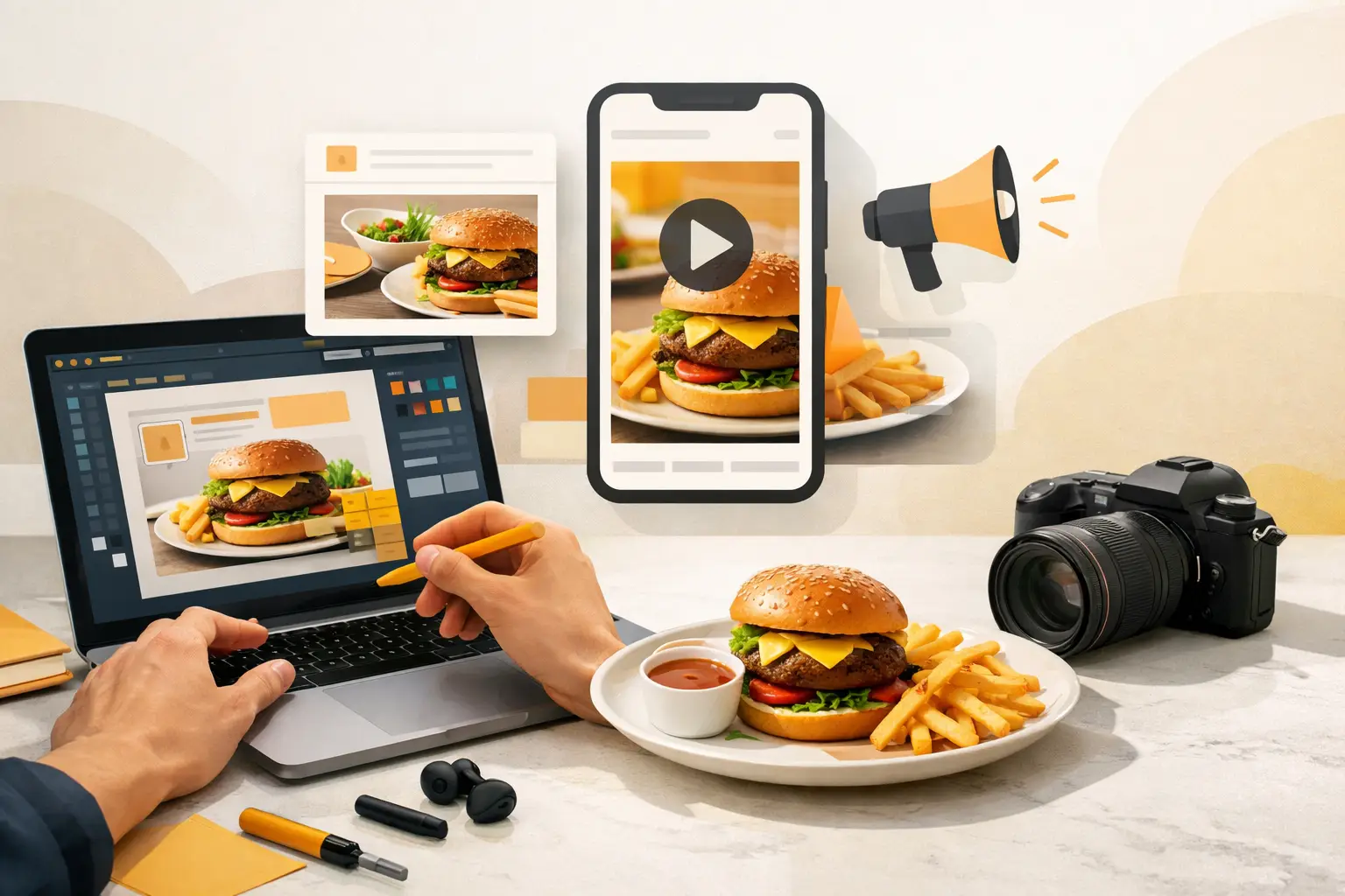
A dinner promo can fail before anyone reads the offer. If the burger looks flat, the lighting feels off, or the layout buries the price, the ad loses on the first scroll. That is why learning how to create restaurant ad creatives starts with one hard truth: food ads are judged in a split second, and the visual does most of the selling.
For restaurants, speed matters almost as much as quality. You are not building one hero campaign a quarter. You are producing lunch promos, seasonal specials, delivery ads, loyalty pushes, and social placements every week. The creative process has to support volume without turning every campaign into a photo shoot, redesign, or approval bottleneck.
How to create restaurant ad creatives that actually convert
High-performing restaurant ads usually do three things well. They make the food look desirable, they communicate the offer fast, and they match the format people are seeing in the feed, search result, or display placement. When one of those breaks, performance drops.
This is where many restaurant teams waste time. They focus on adding more text, more design elements, or more menu items when the issue is simpler. The customer does not need the full menu in the ad. They need one clear reason to act now.
Start with the campaign objective. A dine-in promotion, a delivery conversion ad, and a grand opening campaign should not use the same creative logic. If the goal is online orders, the ad should center on one product, one price point or incentive, and one frictionless action. If the goal is awareness, the creative can sell atmosphere, signature items, or brand distinctiveness. Good ad creative is not just attractive. It is aligned with the business outcome.
Choose one product story per ad
The fastest way to weaken a restaurant ad is to cram in too much. A pasta dish, three cocktails, a dessert, two taglines, and a promo code create visual competition. The ad becomes busy instead of persuasive.
A better approach is to assign each ad one product story. That story might be indulgence, value, freshness, speed, or limited-time appeal. A close-up fried chicken sandwich with melted cheese and crisp texture sells indulgence. A family meal bundle with visible portions sells value. A bright bowl with fresh produce and clean composition sells freshness.
This does not mean every ad has to be minimal. It means every ad needs a clear hierarchy. The eye should land on the food first, the offer second, and the call to action third.
Build the visual before the copy
In restaurant advertising, the image usually earns the first click. Copy supports the visual, but it rarely rescues weak food presentation. That is why the production workflow should begin with the visual concept.
Define the dish, angle, lighting style, background, crop, and platform format before writing the headline. If the ad is for mobile social, a tighter crop with bold food detail often performs better than a wide scene. If the placement is display or web banner inventory, you may need cleaner negative space for the offer and CTA.
Consistency matters here. If your ads use different lighting styles, plating choices, or color temperatures every week, the brand starts to feel fragmented. The creative does not need to be identical across campaigns, but it should feel like it came from the same restaurant.
The production system behind better restaurant ad creatives
Most restaurants do not struggle because they lack ideas. They struggle because production is too slow. Traditional food photography can deliver excellent assets, but it is expensive, time-intensive, and hard to repeat every time a menu item changes. Stock imagery solves speed, but it usually breaks authenticity. Generic AI tools can help with volume, but food is a difficult category if the platform is not built for it.
The practical fix is to treat ad creative as a repeatable production system. That means creating assets in batches, working from defined visual styles, and generating multiple variants for different channels and offers. A single product image should not have one life. It should become a static ad, a story crop, a short promo animation, a delivery banner, and a retargeting variant.
For teams producing food campaigns at scale, niche creative tooling has a clear advantage. A platform like Umami AI fits naturally into this workflow because it is purpose-built for food visuals rather than general image generation. That matters when you need realistic textures, appetizing composition, and campaign-ready outputs without organizing another full shoot.
Create variations on purpose
One ad is rarely enough. Performance usually improves when you test controlled variations instead of guessing. The mistake is changing everything at once. If the image, headline, color, offer, and CTA all change together, you do not know what improved the result.
Create variants with a single variable in mind. Keep the dish constant and test offer language. Keep the offer constant and test two visual treatments. Keep the image constant and test CTA placement. This is especially useful for restaurants running paid social or local campaigns where small creative shifts can move click-through rate or cost per conversion.
There is a trade-off here. More variation can improve learning, but too many versions can overwhelm a small team. The right balance depends on budget, platform mix, and how often the menu changes. For many restaurants, three to five thoughtful variants per campaign is enough.
Match the creative to the channel
Restaurant marketers often reuse the same ad everywhere and hope it works. It usually does not. Creative that performs on Instagram Stories may underperform in search display placements. A square image built for social can look cramped in a horizontal banner. A text-heavy ad that works in email may fail in a fast-scrolling feed.
Channel-fit matters. Social ads need immediate visual impact and minimal reading effort. Search and display often need stronger offer visibility. Video placements benefit from motion that emphasizes steam, pours, texture, or assembly. If the same promotion runs across multiple channels, the message can stay consistent while the creative format changes.
This is where shorter production cycles create an advantage. When assets can be generated and adapted quickly, restaurants can produce the right version for each placement instead of forcing one design into every slot.
What strong restaurant ad creatives usually include
The best restaurant ads are not complicated, but they are disciplined. They typically include a hero food visual, a concise offer, a readable brand cue, and a clear action. Every extra element has to justify itself.
A strong visual should make the food feel immediate. Texture, warmth, contrast, and portion visibility all matter. If the ad promotes a combo or bundle, the composition should show value clearly. If the campaign is premium, the styling should reflect that rather than leaning on discount language.
The offer has to be legible and specific. “Order now” is weaker than “Free delivery tonight” if delivery is the incentive. “Try our new menu” is weaker than naming the actual item. Specificity reduces friction.
Branding should be present but not dominant. Restaurant ads fail when the logo takes priority over the food. People respond to appetite first. Branding needs to support recall without interrupting the selling moment.
Finally, the CTA should match intent. “Reserve a table,” “Order pickup,” and “Get delivery” signal different next steps. The more relevant the CTA is to the user and platform, the stronger the ad path becomes.
How to keep quality high when you need volume
Volume is where most restaurant teams lose consistency. A campaign starts with polished launch assets, then follow-up ads get rushed, cropped poorly, or built from mismatched visuals. Over time, performance softens because the brand looks less credible.
The fix is operational, not just creative. Define a small set of visual standards for ad production: preferred angles, lighting direction, text density, color treatment, and platform-safe layouts. Then build every new ad from that system. This makes output faster and keeps quality stable even when campaigns move quickly.
It also helps to separate evergreen creative from short-term promotional creative. Evergreen assets should cover core categories, signature dishes, and baseline brand visuals. Promotional assets can then rotate around limited-time offers, local events, or daypart campaigns. That structure prevents every ad from being built from scratch.
If you are wondering how to create restaurant ad creatives without constant reshoots, this is the real answer: reduce production friction, standardize what good looks like, and generate more usable variations from every concept.
Strong restaurant ads do not come from bigger brainstorms. They come from faster decisions, clearer offers, and better food visuals built for the actual channel. When your creative workflow is set up that way, every campaign gets easier to launch and harder to ignore.