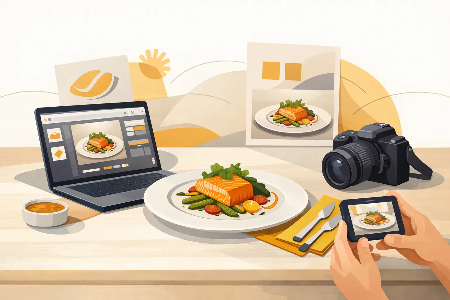
A dish photo can look impressive and still be wrong for the brand. The garnish is off, the lighting feels too editorial, the plate looks more upscale than your pricing, or the background pushes the image toward a different audience. That is the real challenge behind how to generate branded dish visuals - not just making food look good, but making it look commercially aligned.
For restaurants, food brands, agencies, and e-commerce teams, branded visuals need to do a specific job. They have to support conversion, reflect the business accurately, and scale across menus, ads, delivery apps, product pages, and social content. If the visual system is inconsistent, the brand starts to look fragmented. If production is too slow, content calendars slip. If every image requires a custom shoot, the cost structure stops making sense.
The practical answer is to treat visual generation as a repeatable production workflow, not a one-off creative exercise. When the process is structured correctly, you can create dish imagery faster, keep brand standards intact, and produce more assets without rebuilding the concept every time.
What branded dish visuals actually need to do
A branded dish visual is not just a nice image of food. It is an asset built to match a business identity and a channel objective. That means the image has to reflect your brand's styling choices, product truth, audience expectations, and format requirements at the same time.
For a fast-casual chain, that might mean bright overhead compositions, clean packaging visibility, bold colors, and consistent side items. For a premium dessert brand, it might mean tighter framing, richer shadows, more texture detail, and a slower, more indulgent mood. For a beverage seller, it could mean repeatable condensation effects, glassware consistency, and high-contrast color treatment that works in paid social.
This is where many teams lose time. They focus on making single images look polished, but they do not define the repeatable visual rules that make the output usable at scale. Once those rules are clear, generation gets much easier.
How to generate branded dish visuals without losing consistency
The fastest way to lose consistency is to start every asset from scratch. Branded output improves when you lock a few variables early and only change what needs to change.
Start with the brand surface. Define the colors that should appear in the frame, the type of plating or packaging the audience associates with your business, the preferred camera angle, the lighting style, and the overall level of realism. A delivery-first burger brand will usually need different choices than a natural foods product line or a fine dining concept. There is no single correct look. There is only visual alignment with the offer.
Then define the dish truth. This matters more than teams expect. If your signature pasta always uses a shallow white bowl, rustic tomato texture, and visible basil finish, those details should stay stable across assets. The same applies to burger bun shape, salad ingredient density, sauce placement, beverage ice level, or dessert portioning. If those elements drift too much, the image may still look appealing, but it stops reinforcing recognition.
Next, set channel intent before you generate. A hero image for a homepage, a square asset for Instagram, a menu thumbnail, and a vertical short-form visual are not the same job. Composition should respond to placement. Tight crops may work for paid ads, while menu visuals need clarity and fast readability. If you skip this step, you often end up regenerating assets because the image is attractive but not usable.
Build a visual system before you build volume
Teams that need recurring content should think in systems, not campaigns. A visual system gives you a production baseline that keeps outputs stable even when you are generating a lot of variations.
That system should cover a few non-negotiables: framing, lighting direction, background style, prop density, color temperature, and how branded elements appear in the scene. For some brands, the food should always be the only focus. For others, packaging, utensils, table surfaces, or branded wrappers are part of the sale. Both approaches can work, but they should be chosen deliberately.
A useful way to structure this is by creating visual lanes. One lane might be clean product-forward menu imagery. Another might be campaign creative with stronger mood and styling. Another might be social-first content with motion-ready compositions and more negative space for text overlays. When these lanes are defined, creative teams can generate faster without blending every use case into one generic look.
This is also where specialized food workflows have an advantage over general-purpose image tools. Food has its own visual logic. Texture, steam, sauce behavior, freshness cues, and plating realism are harder to fake consistently if the platform is not built around food output.
The input quality changes the output quality
If you want better branded visuals, give the system better direction. Vague inputs produce generic food content. Specific inputs produce usable commercial assets.
That does not mean every prompt needs to be long. It means the direction should be operational. Include the dish type, plating or packaging, camera angle, lighting style, background, mood, and any branded constraints. If the asset is meant for a lunch promo, say so. If it needs to feel affordable, fast, premium, indulgent, healthy, or family-oriented, say that too.
Reference consistency matters just as much. Use the same descriptive language for recurring dishes and campaigns so the outputs remain closer together over time. If one team says "warm natural light" and another says "high-contrast studio lighting" for the same menu category, the brand starts splitting visually.
The trade-off is speed versus precision. Minimal direction is faster at first, but it usually creates more revision cycles. More structured input takes slightly longer upfront and saves time across a batch.
Where teams usually get branded food visuals wrong
The most common mistake is chasing aesthetic quality without checking business fit. A dramatic image may look premium, but that can be a problem if the brand promise is fast, approachable, and value-driven. Visual polish is not the only goal. Match matters more.
Another frequent issue is over-styling. Props, dramatic shadows, aggressive garnish, and exaggerated textures can make the food look less believable for everyday buyers. That may work for a campaign concept, but not for menu systems or product pages where customers want a clear, honest read on the item.
There is also the issue of inconsistency between static and motion assets. A brand may generate strong still images, then produce short-form visuals that use different color treatment, different plating logic, or a totally different mood. If your content pipeline includes both images and video, the brand rules should extend across both.
Finally, teams often underestimate operational planning. If your workflow does not account for usage volume, credit consumption, or the difference between quick drafts and final assets, production gets expensive or slow in avoidable ways.
A practical workflow for branded dish production
The cleanest workflow starts with a base look for the brand, then expands by asset type and campaign need. Establish a reusable style direction for your core dishes first. Once those are approved, create variations by channel, promotion, and season rather than reinventing the visual identity every time.
For example, a restaurant group might create a baseline set for burgers, bowls, cocktails, and desserts. From there, the team can generate lunch specials, holiday themes, app banners, and vertical promos while keeping the same underlying visual language. That approach reduces creative drift and keeps review cycles tighter.
This is also where a commercial platform matters. A food-specific system such as Umami AI is designed around production use, not just experimentation. That means teams can move from concept to volume with more control over image creation, composition workflows, and food-focused output. For marketers and operators, that is the difference between making a few good visuals and building a usable content engine.
If you manage multiple locations, multiple SKUs, or multiple campaigns, plan output in batches. Generate by category, review by use case, then allocate final assets where they will perform best. This keeps creative production tied to business priorities instead of random requests.
How to know your branded visuals are working
The test is simple. Can someone see the asset out of context and still recognize the kind of brand it belongs to? If the answer is yes, your system is likely strong. If every image looks technically good but could belong to any food business, the branding layer is too weak.
You should also track whether the visuals reduce production friction. Good branded generation should shorten approval cycles, expand campaign capacity, and make it easier to keep menus, websites, social posts, and ads visually aligned. If the images still require major rework every time, the workflow needs refinement.
The goal is not to remove creative judgment. It is to give that judgment a repeatable structure. Once you have that, branded dish visuals become easier to produce, easier to scale, and much more useful across the business.
The strongest food content is not the most decorative. It is the content that looks right for the brand, right for the offer, and ready to ship when the campaign needs it.