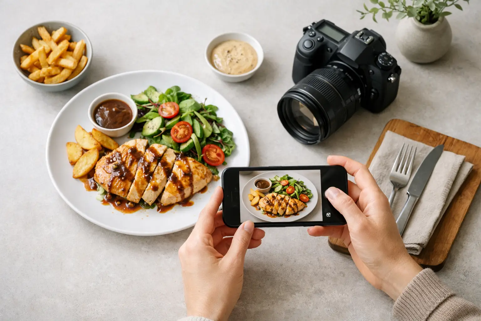
A menu photo has one job: make the item feel worth ordering right now. If you're figuring out how to generate menu photos, the standard for success is not artistic novelty. It is speed, consistency, and commercial usefulness across menus, delivery apps, ads, and social placements.
That changes the workflow. You are not building a gallery piece. You are producing food visuals that match your brand, fit your channels, and can scale beyond a one-off hero shot. For restaurant groups, ghost kitchens, food brands, and agencies, that usually means AI-generated menu photos outperform traditional production on turnaround, cost, and volume.
How to generate menu photos for real business use
The fastest way to get usable results is to start with the business constraint, not the image style. Ask where the image will live, what dish needs to be shown, and how much variation you need. A menu board image, a delivery app thumbnail, and a paid social creative for the same burger should not be treated as the same asset.
When teams skip this step, they get attractive images that fail in production. The angle is wrong for a menu layout, the crop cuts off the product, the garnish is too fussy for quick-service branding, or the lighting feels premium when the concept is casual and price-driven. Good menu photos are not just appetizing. They are operationally aligned.
Start with the dish spec
Before generating anything, define the dish in plain commercial terms. Include the core ingredients, portion style, plating format, packaging if relevant, and what absolutely must appear in the frame. If you're selling Nashville hot chicken tenders in a black takeout tray with pickles and fries, that needs to be explicit. If the fries are optional upsell material and should not appear in the base menu image, say that too.
This is where AI becomes more efficient than a photo shoot. You can specify the exact version of the product you want to market rather than hoping a studio setup lands close enough. The tighter the dish spec, the less time you spend correcting outputs later.
Choose the visual role of the image
Menu photography usually falls into one of three buckets: clean catalog-style product shots, slightly styled hero images, or promotional variations built for campaigns. The right choice depends on channel.
For in-store menus and ordering platforms, clean and legible usually wins. Customers need to recognize the item fast. For homepage banners or limited-time offers, a more dramatic composition can make sense. For ad sets, you may need several versions with different crops, backgrounds, or motion-ready framing.
That trade-off matters. The more stylized the image becomes, the less flexible it can be across every placement. If your team needs volume, standardization often delivers more long-term value than visual drama.
Prompting for menu photos that look usable
A weak prompt creates generic food content. A production-grade prompt creates direction. The difference is usually specificity around product, framing, lighting, and commercial context.
Start with the food item, then define the presentation. Mention the container or plate, camera angle, background simplicity, lighting style, and intended realism. If the image is for a fast-casual brand, say so. If it should look like a premium steakhouse menu asset, say that instead. The AI needs a business context, not just a dish name.
What to include in your prompt
A strong prompt usually covers the dish, the styling level, the camera perspective, and the mood. For example, you might describe a crispy chicken sandwich with a glossy brioche bun, fried chicken filet, pickles, and sauce, shot at a three-quarter angle on a clean neutral background with bright commercial lighting and realistic texture.
You also need to state what you do not want. Call out messy spills, over-styled props, extra ingredients, unrealistic garnish, text overlays, or cluttered backgrounds if those would make the image less usable. Negative direction saves time because it reduces the number of nearly-right images that still need revision.
Build for consistency, not just one good image
Most businesses do not need one perfect menu photo. They need 20 to 200 images that feel like they belong to the same brand system. That means your prompts should be repeatable.
Use a fixed structure for every item. Keep lighting direction similar, use a narrow range of camera angles, and stay disciplined about background treatment. If one taco image looks bright and minimal while the burrito image looks moody and rustic, the menu starts to feel inconsistent even if both shots look good individually.
This is where a food-specific workflow has a practical advantage. With a platform built around food visuals, your output tends to reach the target faster because the generation logic, composition controls, and styling assumptions are already closer to what food marketers need.
Composition choices that affect conversion
The best menu photos make the item easy to read in one glance. That sounds obvious, but many teams generate images that are visually rich and commercially weak.
A good menu image usually centers the product, keeps the silhouette clear, and avoids unnecessary props. The viewer should immediately understand what they are ordering. For handheld foods, that often means three-quarter or front-facing angles. For bowls, salads, and pizzas, overhead can work better. For beverages, clean side views often convert best because shape and color are part of the appeal.
It depends on the category. A stacked burger benefits from height and visible layers. A pasta dish may need a shallower angle to show texture. A packaged snack product should prioritize branding and label readability over restaurant-style plating. The image should match the sales job.
Backgrounds and props
For menu use, less is usually more. A plain or lightly textured background keeps the focus on the food and makes the image easier to crop across formats. Heavy prop styling can make a visual feel premium, but it also creates friction when that same asset needs to fit an app thumbnail, tabletop display, and digital menu board.
Props make sense when they support the concept. A coffee drink with a few beans or a breakfast plate with a folded napkin can work. A crowded tabletop scene usually does not. If the product has to work at small sizes, simplicity is an asset.
Editing the output into menu-ready assets
Generating the image is only half the job. The asset still needs to fit production requirements.
First, review realism. Check ingredient accuracy, proportions, and any obvious distortions. Food buyers notice when a sandwich has impossible layers or when a drink glass bends in a subtle but distracting way. A polished image still fails if it breaks trust.
Next, review crop flexibility. Menu photos should have enough breathing room to work in square, vertical, and horizontal placements. If the product sits too close to the frame edge, the asset becomes fragile. That limits reuse and increases production time later.
Then look at brand fit. Ask whether the image matches your current packaging, menu design, pricing tier, and customer expectations. A luxury fine-dining visual can hurt a value-focused chain if it overpromises the experience. The reverse is also true. Visual mismatch creates friction even when the food looks appetizing.
When AI menu photos make the most sense
AI is strongest when you need speed, coverage, and repeatability. It is especially useful for menu expansions, seasonal launches, A/B creative testing, franchise systems, and brands that sell through multiple channels. If you need ten visual directions for the same dish by tomorrow, a traditional shoot is rarely the efficient option.
That said, there are cases where hybrid production makes sense. Signature campaign assets, packaging hero imagery, or highly regulated product visuals may still benefit from a conventional shoot with post-production support. The question is not whether AI replaces every photo. It is whether your current production model is too slow and expensive for the volume you need.
For many food businesses, the answer is yes. That is why specialized platforms like Umami AI are gaining traction. They are built for food teams that need commercially usable visuals at scale, not generic image generation that happens to include food sometimes.
A better workflow for teams producing at volume
If your team generates menu photos regularly, the goal should be systemization. Create a repeatable input format for each dish. Standardize your prompt structure. Define acceptable camera angles and background types. Review outputs against brand rules, not personal taste.
That approach saves more time than chasing the perfect prompt every time. It also makes scaling easier across locations, product lines, and campaigns. Once the workflow is stable, adding new dishes becomes a production task instead of a creative bottleneck.
The practical advantage is simple: you can move from idea to asset fast enough to support how food marketing actually works now. Menus change. Promotions rotate. Channels multiply. Your image pipeline needs to keep up.
The best menu photo is not the one that took the most effort. It is the one that makes the next order easier to win.