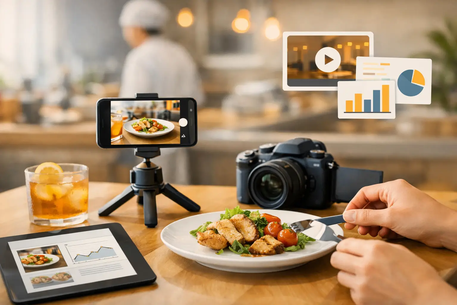
A dinner promo misses for a simple reason more often than teams admit: the food looked forgettable before the customer ever read the offer. That is why a restaurant visual content guide matters. For restaurants, ghost kitchens, and food marketers, visuals are not decoration. They are production assets tied directly to clicks, orders, bookings, and average ticket size.
Most restaurant teams do not have a content problem in the abstract. They have a workflow problem. They need menu images, paid social creative, website headers, delivery app assets, seasonal campaign updates, and short-form motion content on a schedule that rarely matches the cost or logistics of traditional shoots. A practical visual system solves that gap. It gives the team a repeatable way to produce food content fast, keep brand standards intact, and avoid starting from zero every time a promotion changes.
What a restaurant visual content guide should actually do
A useful restaurant visual content guide is not a mood board in a shared folder. It is an operating document. It sets standards for how food appears across channels, how often assets are refreshed, what formats the team needs, and who approves what before launch.
That sounds basic, but most inconsistencies come from skipping those decisions. One campaign uses bright overhead shots, another uses dark angled close-ups, and the delivery app listing still shows an outdated dish photo from two menu revisions ago. The result is visual drift. Customers may not name it, but they feel it. The brand looks less credible, and the product looks less desirable.
The guide should reduce that drift. It should define what "on-brand" means in visual terms and make content creation easier, not heavier. If a guide adds friction, teams stop using it.
Start with commercial priorities, not aesthetics
Restaurants often begin with style references. That is backwards. The first step is deciding which business outcomes the visuals need to support.
A fast-casual chain pushing lunch traffic needs different content from a chef-driven concept selling reservations or a ghost kitchen competing on delivery apps. One business may need high-volume product images for rotating offers. Another may need short video loops for paid social. Another may need clean menu imagery that improves online ordering conversion. The visuals can all look strong, but they should be built for different jobs.
This is where trade-offs matter. A highly styled hero shot may work on a homepage banner, but it may not be the best asset for menu browsing where clarity sells better than atmosphere. A dramatic close-up can perform on Instagram, while a simpler, ingredient-forward composition may do more work in an ad. Good visual strategy is less about making every image impressive and more about matching image type to channel intent.
Build around core asset categories
Most teams need the same foundational asset groups, even if output volume varies. The first is product imagery - hero shots of signature dishes, drinks, desserts, combos, and limited-time offers. The second is channel-specific marketing creative for social posts, ads, email banners, and website placements. The third is motion content, usually short-form loops or simple video clips for Reels, Stories, and paid placements.
A strong system also separates evergreen assets from campaign assets. Evergreen visuals cover staples that stay on the menu and represent the brand year-round. Campaign visuals support holidays, launches, local promotions, and seasonal offers. If those categories stay mixed together, teams waste time recreating assets they should already have and lose track of what can be reused.
This is where specialized AI production starts to make operational sense. If the need is recurring, not occasional, speed and consistency matter more than one-off creative effort. A niche platform like Umami AI fits that use case because the output is built around food visuals rather than general image generation.
Define the visual rules that keep output consistent
The most effective restaurant visual content guide includes concrete decisions on composition, lighting, color behavior, cropping, styling, and context. Keep the rules tight enough to create consistency but not so rigid that every image feels duplicated.
For composition, decide whether your brand leans overhead, three-quarter angle, straight-on, or a mix by channel. For lighting, define whether the look is bright and clean, warm and moody, or contrast-heavy. For color, identify what should stay true to life and where brand colors should appear in backgrounds, props, packaging, or text overlays.
Restaurants also need to decide how much lifestyle context belongs in the frame. A burger against a clean background communicates differently from a burger shown in a table setting with hands, drinks, and sides. Neither is always better. Clean shots often work better for menus and product modules. Contextual scenes can add energy for ads and social. The guide should state when each format is appropriate.
Your visual content guide for restaurants should include channel logic
One reason content pipelines break is that teams try to reuse a single asset everywhere. That saves time in the short term but usually costs performance.
A visual content guide for restaurants should define what each channel needs. Website hero sections need wider crops and stronger negative space for headlines. Online ordering and menu placements need readable product focus. Social feeds can support tighter crops and more stylized framing. Story and Reel formats need vertical orientation and motion-friendly composition. Paid ads often need multiple variants because top-performing creative changes by audience, offer, and placement.
This is where production volume becomes a competitive advantage. If your workflow only supports a few polished images per quarter, testing becomes limited. If your workflow supports quick asset generation and variation, teams can adapt creative to offers, geographies, and audience segments without rebuilding the process each time.
Speed matters, but so does approval control
Fast visual production is useful only if the outputs are commercially usable. That means the guide should include approval standards, not just creative direction.
Set simple review criteria. Does the food look appetizing and accurate to the menu item? Does the framing fit the channel? Are packaging, plating, and garnish consistent with the brand? Is text placement possible if the asset is used in ads? These checks prevent teams from approving an image that looks attractive but fails in production.
For multi-location brands or agency workflows, approval logic should also define ownership. Marketing may approve campaign direction, operations may confirm menu accuracy, and design may review brand alignment. Without that structure, visual production speeds up but launch still slows down.
Budget reality changes the right content model
Not every restaurant needs the same production setup. A single-location operator may need monthly bursts of menu and promo assets. A regional group may need a constant flow of creatives across brands, channels, and offers. That difference affects the best workflow.
Traditional photography still has a place, especially for flagship campaigns, packaging launches, or high-profile brand work where exact real-world representation matters. But for recurring promotional volume, seasonal updates, variant testing, and evergreen menu support, AI-based food visual production can be more practical. It removes the scheduling, staffing, and reshoot costs that make frequent content updates hard to justify.
The key is not treating it as an all-or-nothing decision. Many teams benefit from a mixed model: periodic premium shoots for anchor assets, then faster AI-driven production for ongoing campaign and channel needs.
Measure output by performance, not taste alone
Visual content often gets judged internally on preference. That is not enough. The guide should tie asset creation to measurable outcomes.
Track which image styles improve menu clicks, ad engagement, add-to-cart behavior, reservation actions, and time on page. Compare clean product shots against more atmospheric scenes. Test whether motion actually outperforms static in your paid social mix. Some categories, like desserts or drinks, may benefit more from stylized content than core entrées. Some offers may convert better when the image is simpler and more product-led.
This is another reason to build a repeatable system. If asset production is inconsistent, performance data becomes harder to interpret. But when composition types, crop logic, and channel use are documented, teams can test variables more cleanly and improve creative over time.
Keep the guide short enough to use
The biggest mistake in a restaurant visual content guide is making it too broad. If it reads like a branding exercise instead of a working tool, it will get ignored.
Keep it practical. Show what the team needs to produce each month, what formats matter most, what the brand look should be, and how assets move from creation to approval to launch. That is enough to create consistency and speed. The goal is not to document every possible visual scenario. The goal is to make the next asset easier to produce and more likely to perform.
Restaurants do not win because they have more content. They win because the right visuals show up on time, look like the brand, and help the customer make a decision faster. If your current process cannot do that consistently, the guide is not a nice-to-have. It is the production layer you have been missing.